How to Build a School Enrollment Page
Your school enrollment page is your best tool for providing an exceptional customer experience and offering much-needed help.

Let’s be honest: Enrolling a child in school can sometimes feel like doing your taxes. As an educator—and maybe a parent yourself—you know firsthand that the process is, well, a process. And sometimes, it can be a confusing one. To be fair, there are many steps in school enrollment, and families may expect to encounter a bottleneck or two along the way. But if you’re lucky enough to have had a smooth enrollment experience, it has probably stayed with you.
When a family is ready to enroll in your school district, they’ve reached the Decision phase of the customer journey. This is a pivotal moment for families—and a make-or-break moment for schools. At this point, families are ready to be a part of your district, but they still have one last step to take in order to make it official. They have to actually enroll. Schools, then, must provide an excellent experience that allows families to easily complete that crucial, final step.
That final step largely takes place on one very important part of your website: your enrollment page. This is one of your best tools for providing an exceptional customer experience and offering much-needed help. It’s the page that can turn a family who’s merely interested in your district into valuable members of your school community. But how exactly can this page help seal the deal? And what steps need to be taken along the way to ensure that it does? Let’s take a look at a few tactical ideas.
Think like your audience.
A strong school enrollment page is first and foremost crafted from the lens of a parent or guardian. That means seeing the enrollment experience from a family’s perspective and empowering them with helpful information so they can make the most informed decision for their child. According to data from sales software company Salesforce, 65% of consumers expect companies to understand their needs—and your families’ expectations of your schools are probably no different. Thinking like your audience is one of the best ways to anticipate families’ needs and proactively provide solutions to meet them.
An enrollment page built from a parent’s perspective starts by answering the most important questions families have. When families are weighing their enrollment options, they’re asking all kinds of important questions about the enrollment process, how your district operates, and everything in between. For example:
- How long does the enrollment process take?
- My child is not zoned for this district. How do we apply for open enrollment?
- Does your school offer after-school care?
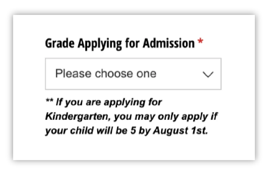
- What is the birthday cutoff for kindergarten?
- What if my child has a 504 Plan or IEP?
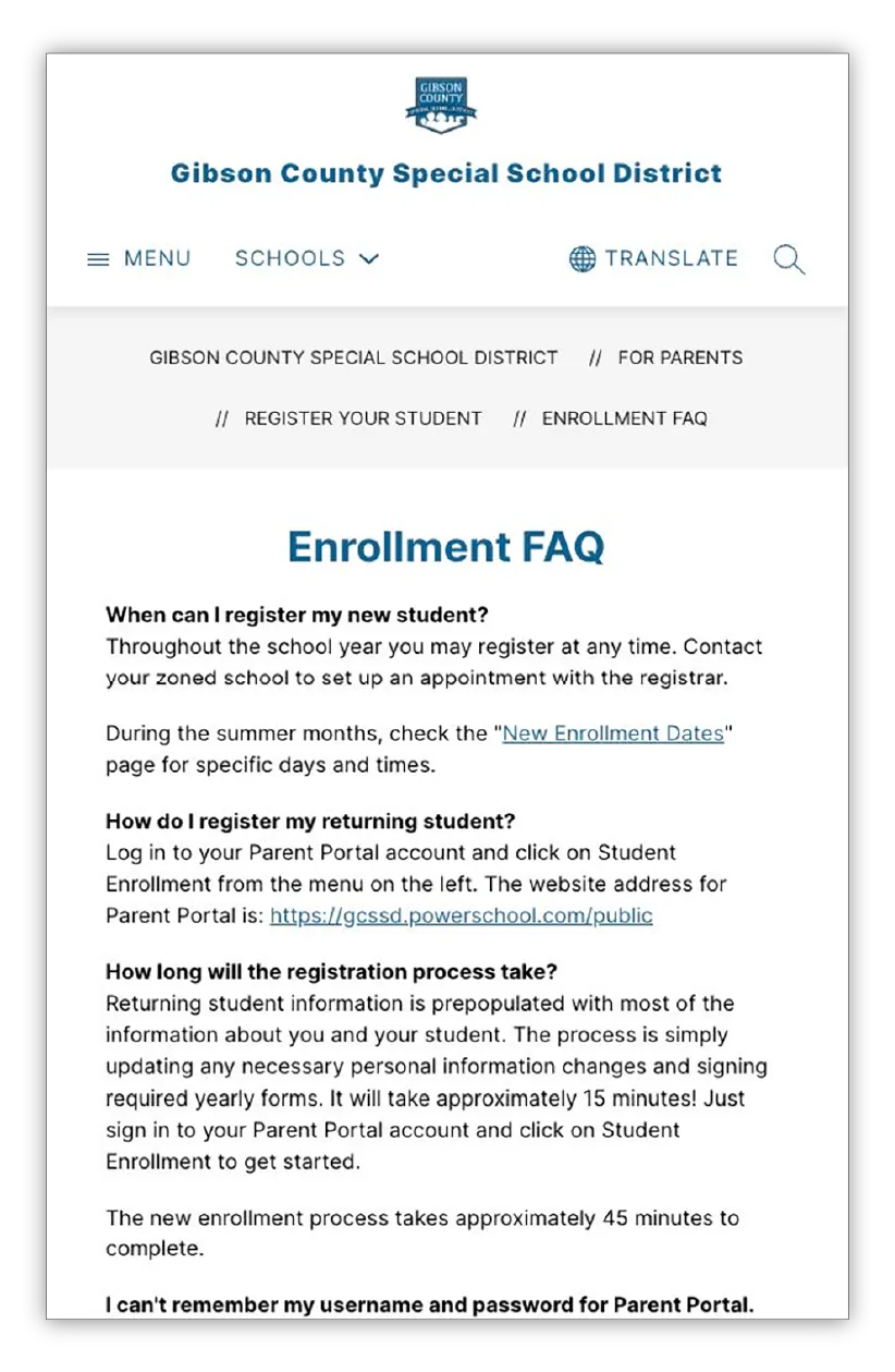
Make a list of all the questions you can imagine families having, then try to provide as many answers as possible in one place. One of the best ways to do this is to feature an FAQ section on your enrollment page. Tennessee’s Gibson County Special School District, for example, links to a detailed FAQ page from their enrollment page. There, families can learn more about the registration process along with answers to other common questions about the district.
If you want to take your FAQ section one step further, consider segmenting it into categories. Elementary school parents are probably asking different questions than high school parents. Similarly, newcomers to your area probably have more questions about your community than families who have lived in your city their entire lives.
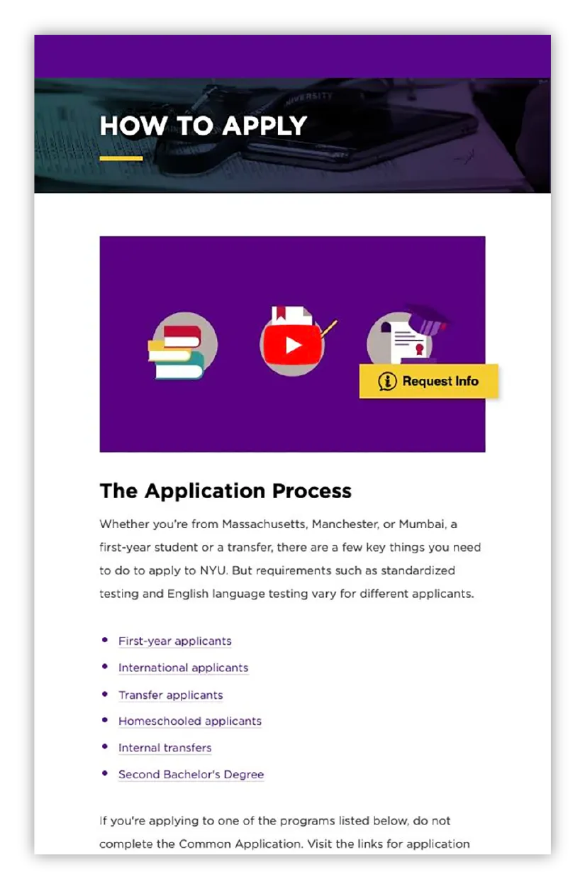
Some enrollees may not even know what questions they should be asking. After all, many pre-K and kindergarten families are going through the enrollment process for the very first time. A page built with them in mind should be proactive about answering these questions. Universities, for example, are great at walking first-time freshmen through the enrollment process. New York University’s “How to Apply” page features a video explaining the enrollment process and what first-time students need to know before applying.
The bottom line is: Think like your audience. By answering all of the common questions families have during the registration process, you can be sure you’re meeting their needs—and bringing them one step closer to completing enrollment.
Make information easy to find and understand.
Your school enrollment page needs to do more than just answer questions; it needs to be easy to navigate and understand. When families have to weed through multiple webpages to find the answers they’re looking for, that’s a frustrating user experience. A good user experience, on the other hand, provides information quickly, easily, and all in one place.
According to research from inbound marketing platform Hubspot, 76% of consumers say the most important factor in a website’s design is that it makes it easy for them to find what they want. Families often have limited time and nonstop childcare duties—so the most thoughtful thing you can do is make your enrollment information easy to find and comprehend.
To put this concept into action, start by simplifying your design. Families have to take a number of important steps to complete the enrollment process: reviewing registration requirements, setting up an account, submitting their application, uploading additional documents, and more. The way these directions are laid out on a page can either make or break the enrollment experience.
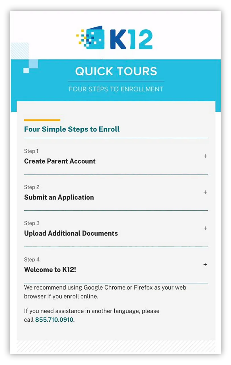
When information is presented in a clean way, it’s less intimidating and easier to follow. Take Arkansas Virtual Academy’s “Four Steps to Enroll” form, for example. All of the school’s enrollment steps are showcased in a neat, condensed order with clear directions, which makes the process less overwhelming. Families simply click on the drop-down bars to complete each step.
Simplifying the design and user experience of your enrollment page isn’t just about aesthetics, though. It’s also about return on investment. According to data from research and advisory company Forrester, every dollar invested in user experience in the private sector brings $100 dollars in return on average. What’s more, good user experience can even increase conversion rates—the rate at which prospective customers become active customers—by up to 400%. In other words, good user experience may have the power to boost your enrollment numbers.
As you take a second look at your enrollment page, think about how design and user experience can help make information easy to find and understand. Try to simplify your design by getting rid of nonessential information—or start small and reorganize your information in a way that’s eye-catching and easy to comprehend.
Optimize your school enrollment form.
Once you’ve equipped families with the information they need, the next step they’ll take is to fill out your student enrollment form. Starting registration is a big step for families—and from an administrator’s perspective, it may seem like the moment you’ve gained a new student in your district. But that’s not always the case.
A recent study from software company Zuko reports that only 66% of people who start a form online successfully complete it. Fortunately, application forms have a higher completion rate: 75%. But that still leaves 25% of families who may or may not complete your form once they’ve begun to fill it out. That’s why optimizing your student registration form is a critical part of building your enrollment page.
1. Try multistep forms.
First, you might try using what marketers call a multistep form—a long form broken into multiple pieces. According to Hubspot, breaking long forms into steps makes them less intimidating. “By allowing customers to complete their information in smaller chunks,” they write, “you create a positive user experience and increase conversions.” Plus, research from startup advisor Venture Harbour indicates that multistep forms garner 300% more conversions than regular forms.
You’ve probably encountered a multistep form if you’ve ever filed your taxes online. Filing your taxes is hardly ever fun, but tools like those offered by H&R Block and many others make the process a little less painful. Instead of requiring people to fill out their information through one long form, H&R Block only asks users to answer one question at a time. The simple design and intuitive user experience also make the process smooth and easy.
2. Focus on function.
Multistep forms aren’t the only way to provide a better registration experience. Another option is to focus on optimizing the functions within your form.
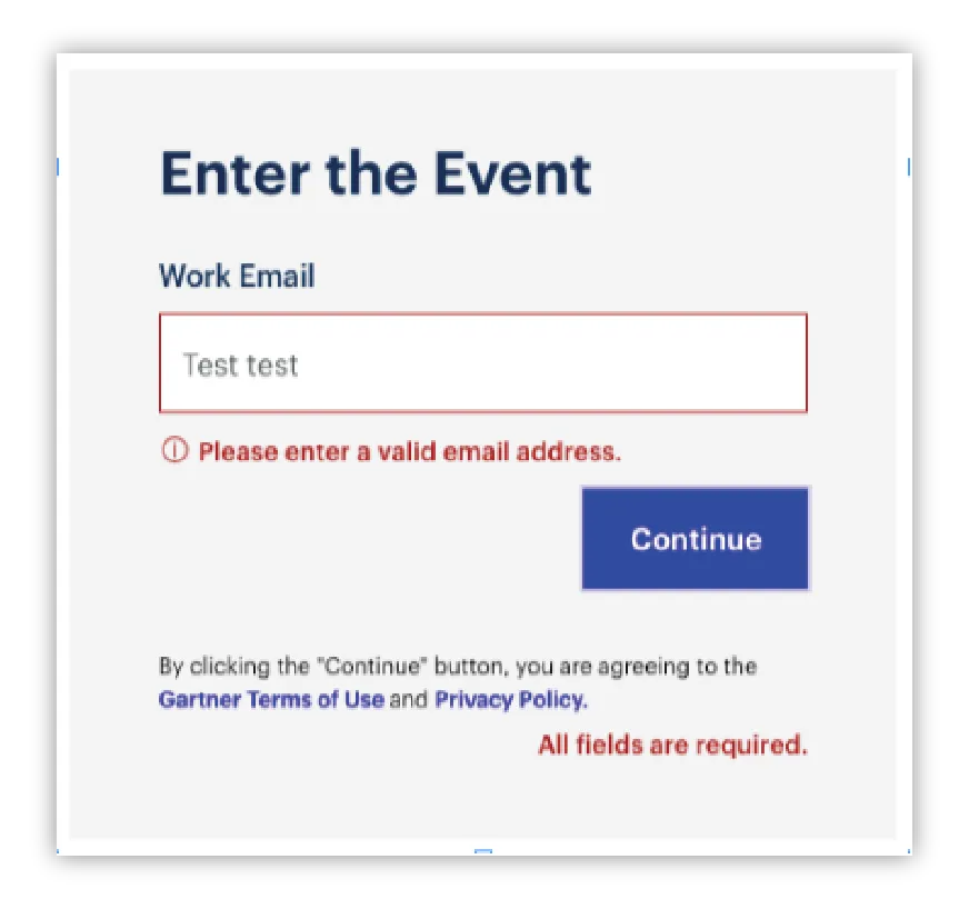
One essential function to use is inline validation: a prompt that tells users where they’ve entered incorrect information on a form and how to correct their mistakes. If you’ve ever accidentally typed in an invalid email address or skipped a required field on a form, you’ve probably encountered inline validation. This simple function, which can usually be turned on through the backend of your form, keeps users from having to guess why their answers can’t be submitted.
Another helpful function to consider for your forms is microcopy: short statements that help users navigate and understand fields on a form. While it’s similar to inline validation, microcopy doesn’t just appear when a user inputs incorrect information. Instead, it can appear anywhere on a digital form to give context to whatever information it asks users to provide.
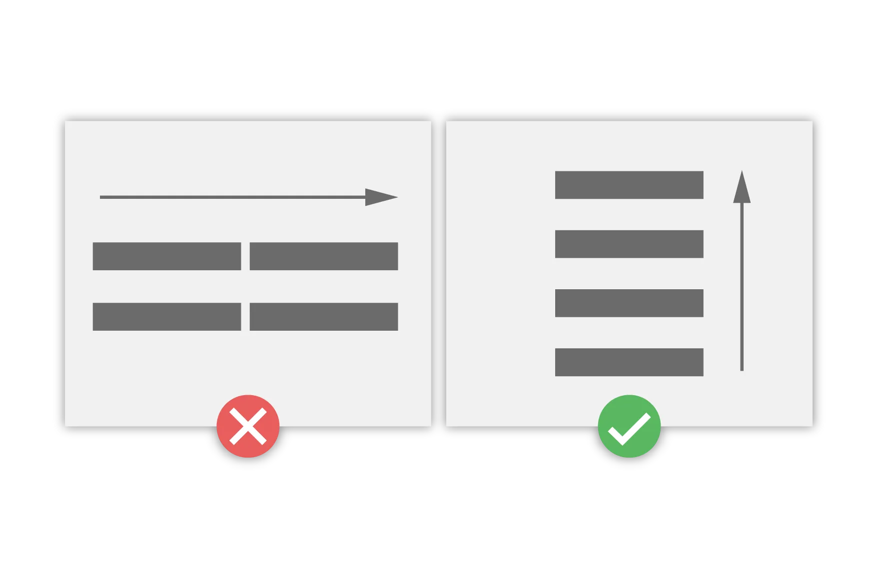
3. Consider layout.
Making small layout adjustments on your student enrollment form can also help—like converting a two-column form into one column. Several studies reveal that one-column forms outperform two-column forms in terms of speed and completion rates. A short study conducted by marketing learning platform CXL Institute found that participants completed single-column forms an average of 15.4 seconds faster than multicolumn forms.
Besides, single-column forms also tend to look and function better on phones than multicolumn forms do. And since more than half of all website traffic comes through mobile devices, that factor can’t be overlooked.
Give your community options.
But what if a family isn’t ready to register? Even though you’ve given them helpful information on your enrollment page, they may still need more details before taking the next step. These in-between families probably won’t fill out your official enrollment form right away; they might need a personal touch to cross the finish line. This could take the form of a follow-up email, a phone call, or an in-person meeting.
You can also add personalization on your school enrollment page. This can be as simple as letting your community choose how they want to enroll. Arkansas Virtual Academy lets parents and guardians choose between registering with an online form, by phone, via online chat, or by downloading their mobile app. Offering options is just another way to provide a deeper layer of hospitality and empathy.
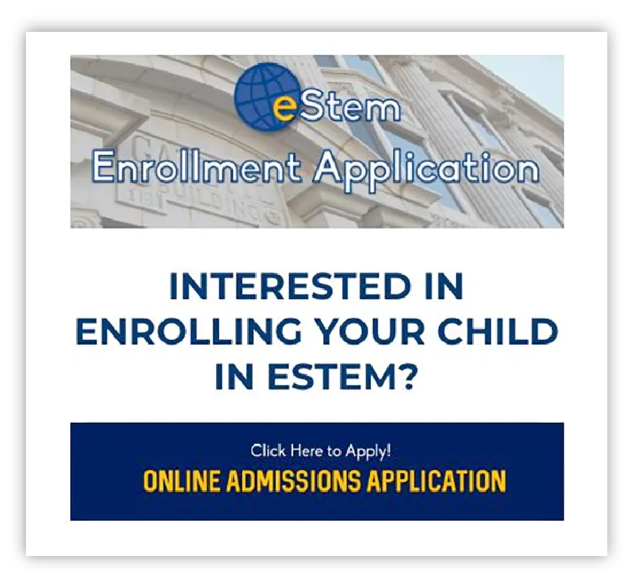
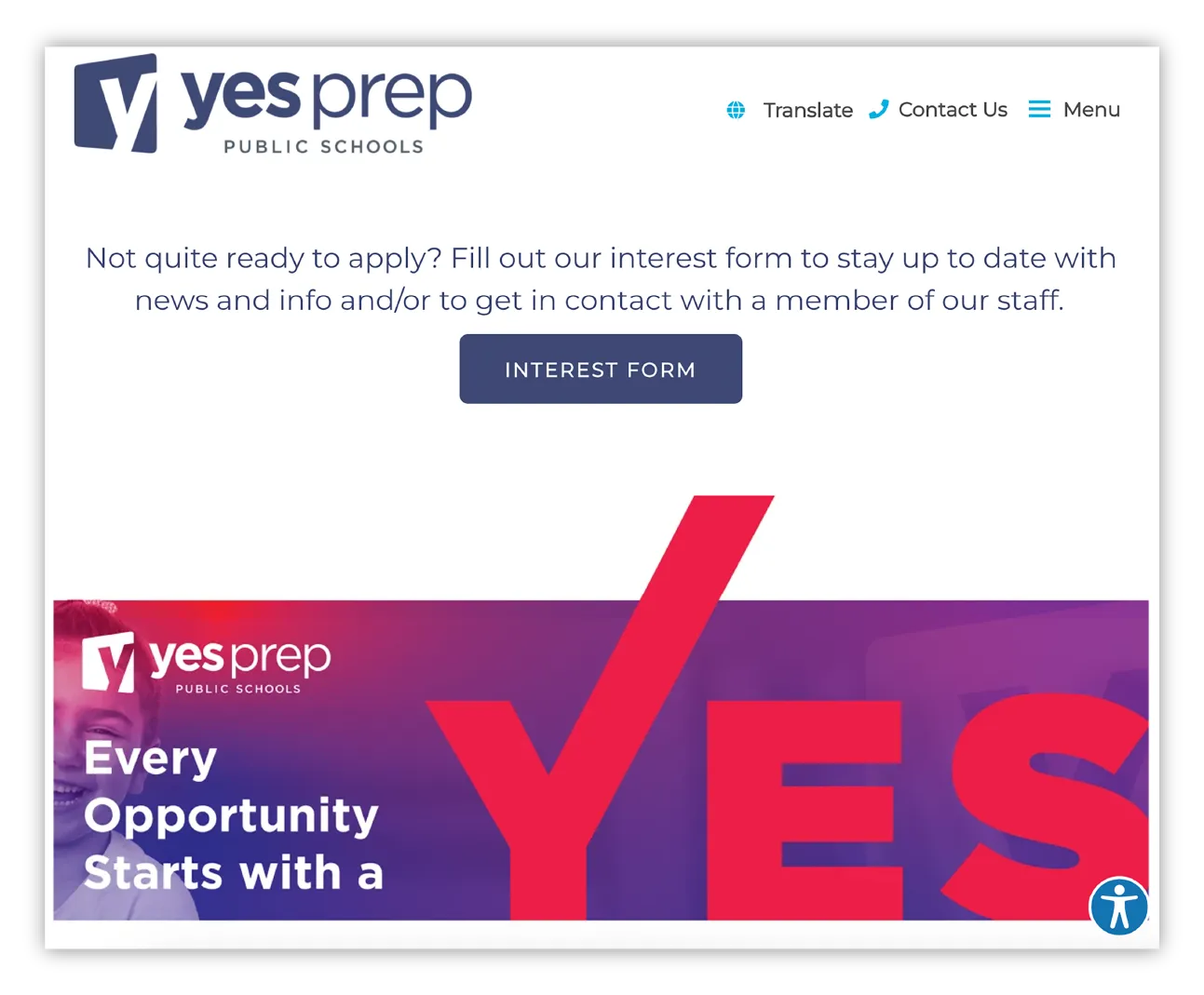
Another way to reach in-between families is to add an interest form at the top of your enrollment page to collect basic information, like an email address, name, phone number, or last school attended. In Arkansas, eStem Public Charter Schools does this well. Their enrollment interest form only takes a few minutes to fill out, making the experience fast, simple, and unintimidating for families in the in-between stage. Public charter school network YES Prep is another great example. They feature an interest form button on their enrollment page for families who are not quite ready to apply but want to get in contact with a YES Prep team member.
It’s the small adjustments on your enrollment page that together make a major impact on the registration experience. Ultimately, the best enrollment page is built from a family’s perspective. It should answer their questions, display information in a way that’s easy to understand, and allow space for personalization.
The enrollment process is—understandably—a stressful time for parents. So if we can leave you with one final thought, it’s this: Your enrollment page should serve families, anticipate their needs, and make their lives easier. That means the details matter—from the customization of your forms to the design and user experience to your FAQs. If your enrollment page is rooted in these principles, you’re already several steps ahead of the curve.
Subscribe below to stay connected with SchoolCEO!