Off the Charts
Using data visualizations to strengthen your district storytelling

Over the past few years, it has become nearly impossible to encounter any new program in education without hearing the term “data-driven.” Instruction is data-driven. School scheduling is data-driven. Even bus routes are data-driven. But how does data contribute to the message your district is sending? The way you talk about data—and visualize it—tells a story about what’s happening in your schools. So how can you present that story in the clearest and most compelling way?
A key point to remember is that data is a means, not an end. Numbers by themselves don’t say much. Think about the last time you read a report containing a string of percentages or data points. Remember how your eyes glazed over? That’s probably because most data is pretty hard to follow without context. Visualizations contextualize the numbers, giving your audience an idea of what your data actually means.
What makes a visualization work?
In our COVID-19 world, there are a lot of charts and graphs floating around seeking to make sense of case numbers. However, none of these efforts are new. In 1854, data visualization helped public health officials solve the mystery behind a rampant cholera outbreak in London.
Survey results accurately listed the locations of reported cases and fatalities, but looking through this information—just a series of names and addresses—didn’t paint a clear enough picture. Dr. John Snow, however, realized that when he mapped this data, an otherwise unnoticeable pattern emerged: a large cluster of cases around Broad Street’s water pump. This pump was pulling from a contaminated drinking source, and thus was the origin of the localized outbreak.
When done right, data visualizations like charts and graphs can reveal insights that a table of numbers can’t. Of course, they also have the potential to bury your data’s insights and confuse your audience. You’ll want anything your district shares to be understandable, actionable, and—above all—accurate.
Make them understandable.
Presenting complicated data in a way that everyone understands can be challenging—but if your audience can’t easily digest your data within a few seconds’ glance, your presentation will miss the mark. Visualizations that are too complex will fail to capture the message you’re trying to communicate.
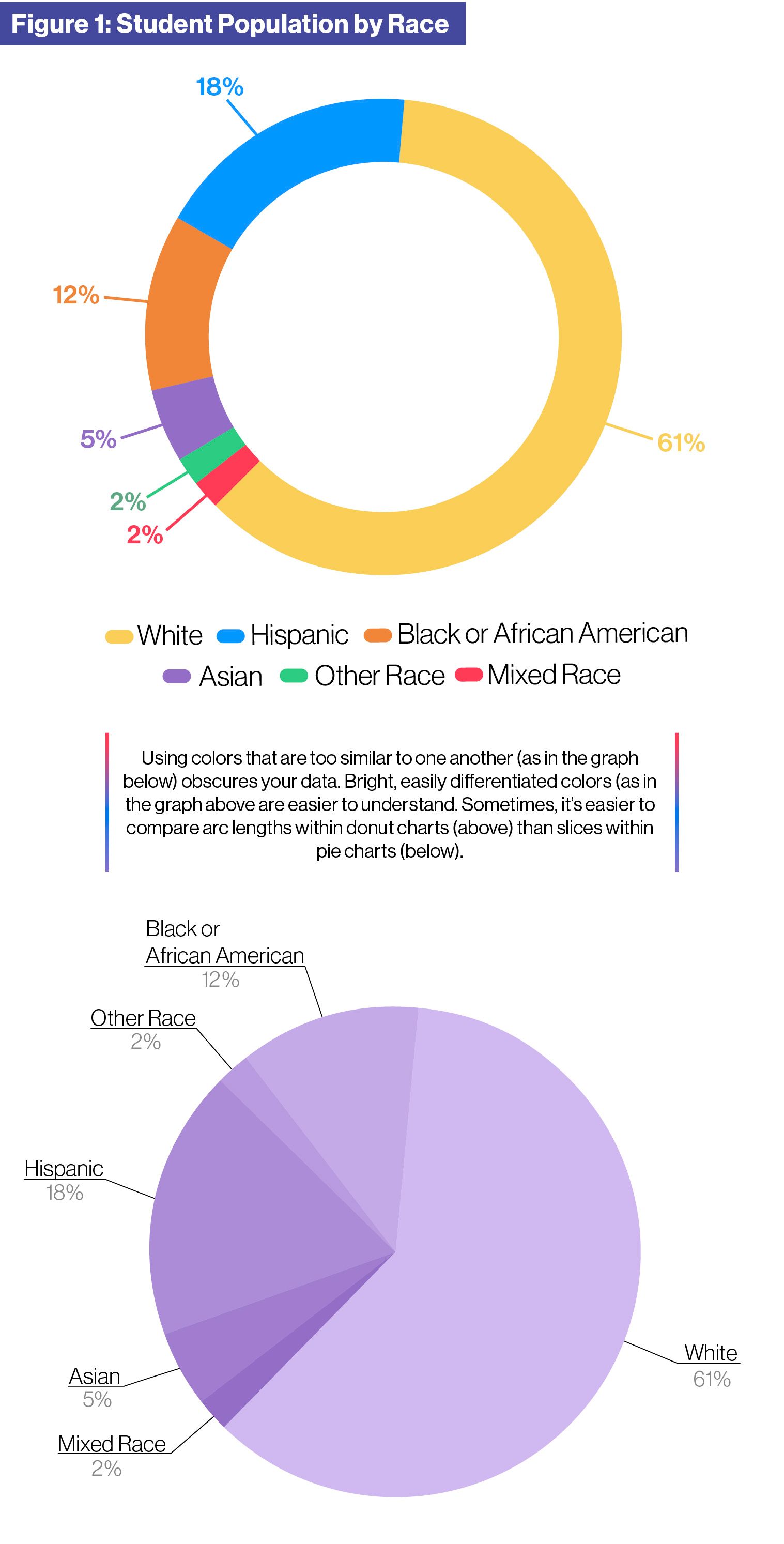
For example, you might be tempted to cram too much information into one chart or graph. Your visualizations may become cluttered with hard-to-read fonts or colors that are too difficult to differentiate from one another (see Figure 1). Keep
in mind that the best graph is often the most straightforward one.
As statistician Edward Tufte explains in his seminal work The Visual Display of Quantitative Information, everything you create should tie back to your underlying data. You want to design simple visualizations that spotlight the data you’re presenting, not your design choices. Your graph could look very impressive at a glance, but too many flourishes may distract your audience from the message you’re trying to convey.
Even when following basic best practices, it may be worth it to run your visualizations by an outside pair of eyes before presenting them to your community. Choose someone who has qualifications similar to your intended audience. For example, if you’re presenting to the chamber of commerce, run your visualizations by a parent who is also a business owner. If they struggle to understand your point, it’s time to simplify further.
Make them actionable.
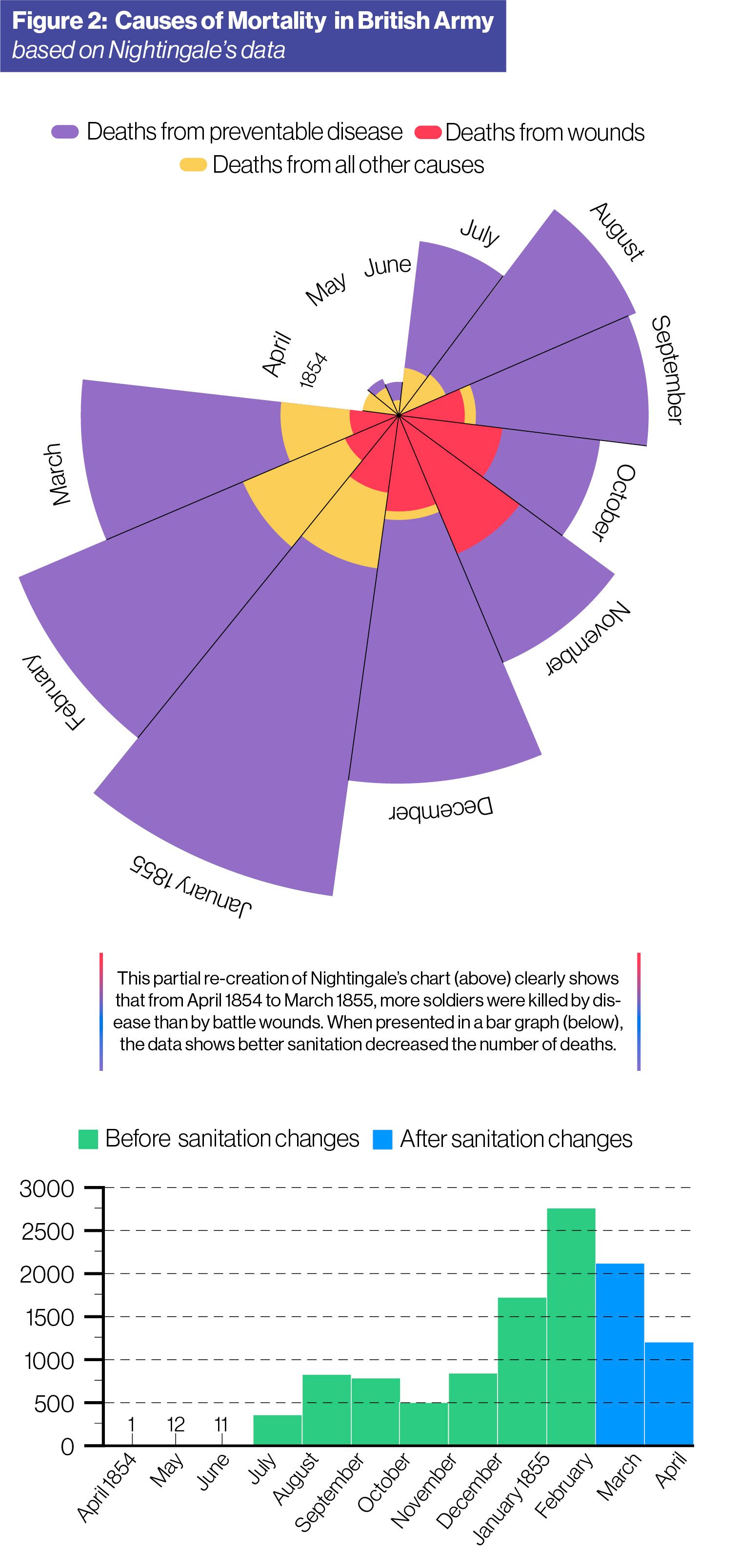
If your visualizations are telling a story, how do you want your audience to feel at the end? You should keep this question front and center as you plan how best to display your data. A memorable example of letting the data tell the story comes from an interesting source—the founder of modern nursing, Florence Nightingale.
Although Nightingale is now known for the contributions she made to nursing, she was also a social reformer who advocated for better sanitation and access to clean water to improve England’s public health. During the Crimean War, she witnessed the transformation that took place once a sanitary commission overhauled horrible conditions at the hospital where she worked. Nightingale came to believe that diseases, not battle wounds themselves, killed most soldiers—and that these diseases, by and large, could be prevented. She returned to England after the war and requested that Queen Victoria form a taskforce to examine health conditions throughout the entire British army.
Despite the sexism of the time—which kept her from being a formal part of the effort—Nightingale contributed a memorable work of data visualization that made the findings of the taskforce strikingly obvious. Her visualization, entitled “Diagram of the Causes of Mortality in the Army of the East,” presents the causes of death for soldiers, broken down by month, before and after sanitary improvements were made (see Figure 2). She clearly shows that preventable diseases (in purple) were the leading cause of death during the war in the months prior to the sanitary commission’s overhaul in March 1855. After the sanitary intervention, mortality rates immediately began to drop, demonstrating that so many of the deaths had been preventable all along.
This visualization, now called a polar area diagram or a rose diagram, broke through to both policymakers and the general public. That’s because when data visualization is done correctly, it can take the same information present in rows
of data or long reports and deliver it with impact. As Nobel Prize-winning cognitive psychologist Daniel Kahneman puts it, “No one ever made a decision because of a number. They needed a story.”
Sometimes, of course, you shouldn’t be creating a graph at all. That is to say, don’t include visualizations in a presentation just to fill space or to add some sort of authority. Sometimes a simple table is the right choice if the situation and the data call for it.
Make them accurate.
Numbers don’t lie—but the way they’re presented can be misleading for your audience, even if that isn’t your intention. Sometimes simple errors or rushed design choices can result in graphs that convey information incorrectly or even present a different story entirely. How does this happen? There are a few basic things to watch out for, such as your labels, your scales, and your general data presentation.
Your audience relies on labels to understand what you’re trying to present. When the labels are confusing, the graph as a whole may fall apart. Keep in mind that most people will read a graph and start drawing conclusions within a matter of seconds. That’s difficult to do when your labels make things harder to understand rather than easier.
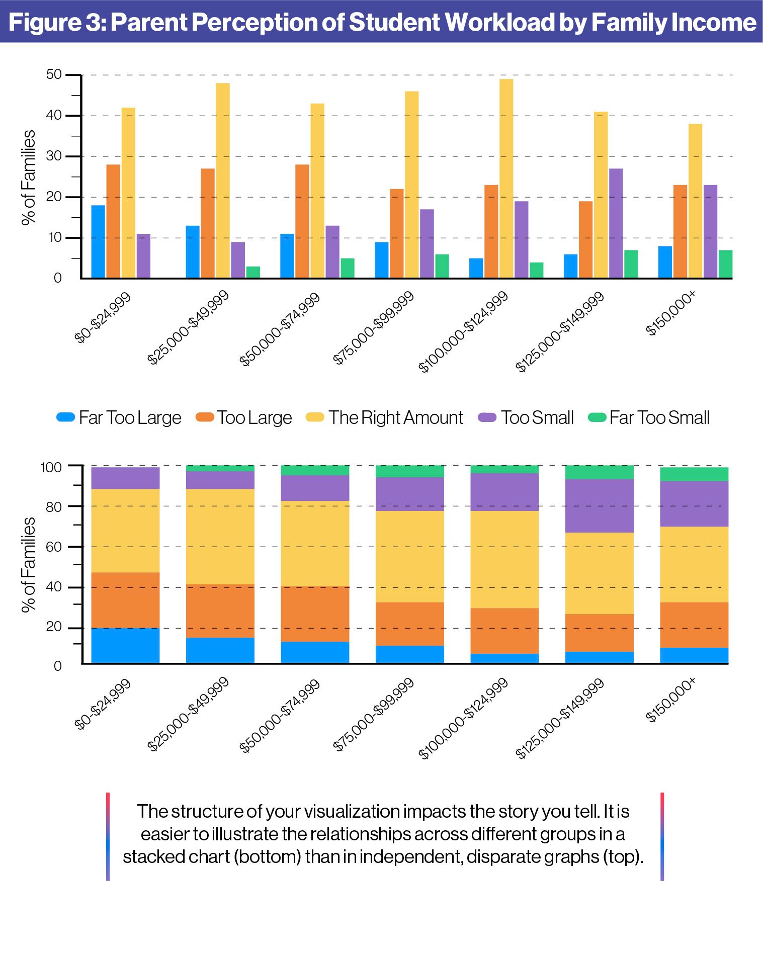
The type of data visualization you use matters for what you’re trying to accomplish. Let’s say you want to understand how virtual learning is impacting your district’s students. Figure 3 breaks down parent perceptions of their students’ workloads along family income lines. You can compare answers within income groups in the top graph, but the way data is displayed along the x-axis makes it difficult to compare answers across groups. A stacked chart, like the bottommost graph in Figure 3, allows you to compare answers both within each group and across income brackets.
All graphs have certain elements, such as axis labels and gridlines, that serve as signposts for the reader. Without these visual cues, it can be very hard to understand what you’re looking at—and what conclusion you’re supposed to draw from the data.
A confusing or poorly-designed scale, either along the x-axis or y-axis, can also obscure your intended point. More often than not, a graph with a bad scale seems to mean one thing when viewed at a glance, but something else entirely when examined more closely.
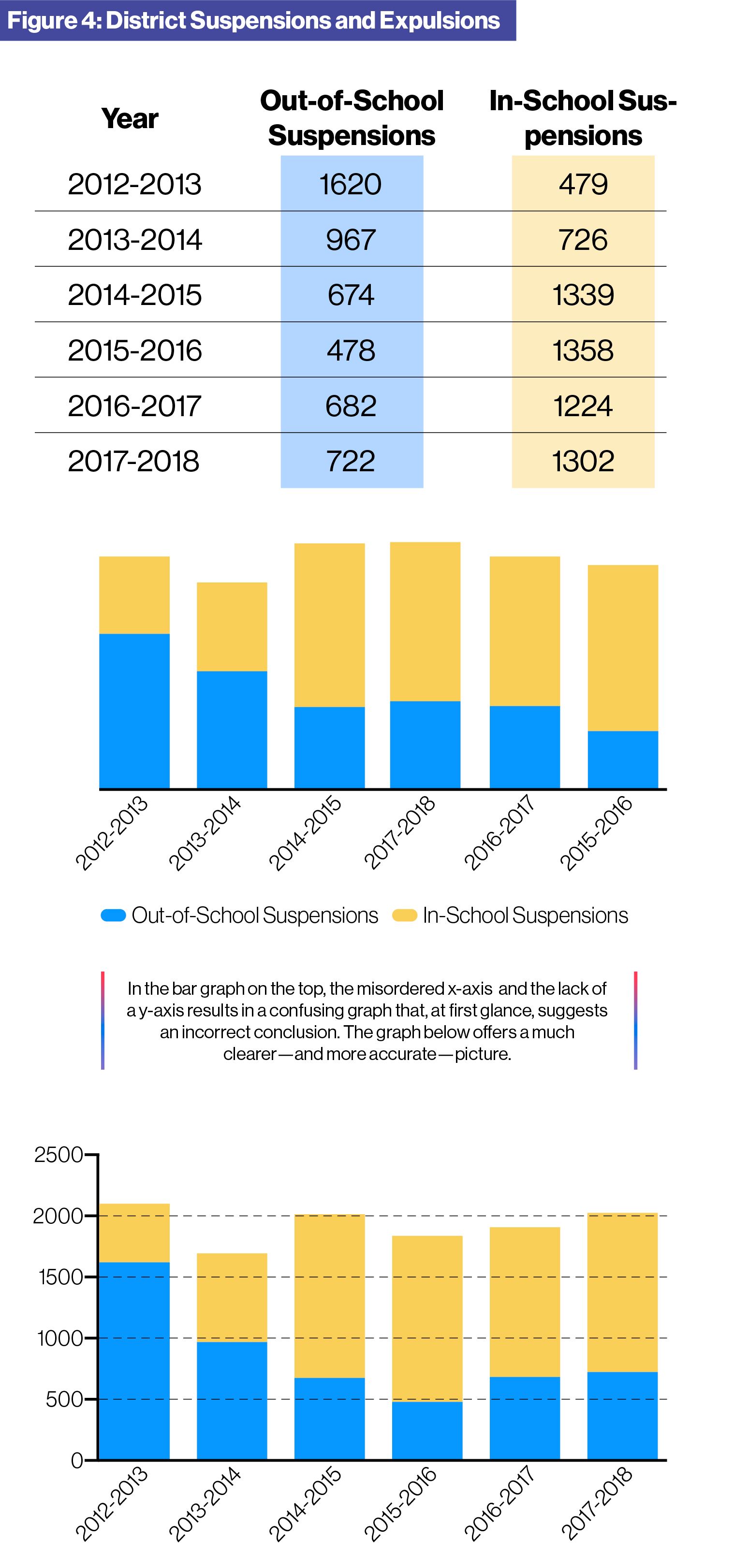
Figure 4 demonstrates how misleading a graph can be when poorly designed. Due to the absence of proper labels, the bar graph on the left appears completely divorced from the data table. What’s more, the leftmost graph makes it look like expulsions are generally decreasing year by year—but that’s not the story the data is telling. Instead, out-of-school suspensions actually increased from 2015-16 to 2017-18—something that’s obvious when the x-axis is ordered chronologically.
You should be using data to inform your decisions rather than defend them, and the visualizations you show your community should help them see where those decisions are coming from. That means understanding what your data says first, then making a chart or graph to illuminate your insights. After all, that’s the benefit of data visualization: highlighting what the numbers are saying so that your audience can better grasp your district’s story.
Finally, you should refrain from manipulating data to create your own narrative. If you find yourself tempted to adjust a visualization so that it looks more favorable to you or the district—don’t. Being candid with your data is the first step toward building an honest, transparent relationship with your stakeholders.
When should you use data visualizations?
Once you understand what good data visualization can do for your communications, the next step is figuring out when to break out a nice chart or graph. As a school leader, you’ll have several opportunities to use visualizations to make information easier to interpret.
One common opportunity for data visualization is in reporting around your district’s strategic plan. You no doubt have certain academic benchmarks you want students to reach over the lifetime of your current strategic plan—what better way to chart progress than with a well-crafted graph? Complicated data points such as test scores or attendance rates might cause eyes to glaze over when put into a massive spreadsheet. But plotting this information into simple graphs keeps your students’ achievements and challenges front and center.
You are also likely to rely heavily on graphs and numbers during bond or levy campaigns. Community members will want to understand how current millage rates compare to previous ones or what the district will spend on construction projects over time. In this situation, it’s especially important to ensure you’re not putting out anything that could be confusing or poorly designed. The very last thing you want is to create the impression that you manipulated or concealed data.
Ultimately, the benefits of a data visualization depend on the data set. Plotting discipline rates in your district by race, for example, might highlight disparities that need to be addressed by new or improved policies. Anytime there is important information worthy of further inspection or discussion, that’s a prime opportunity to use clear, actionable, and accurate data visualizations.
Depending on the size of your district, the task of creating data visualizations may not always fall to you. However, knowing best practices for sharing data with your community can help ensure that nothing gets miscommunicated or overlooked. After all, your district brand ultimately falls to you as a school leader. You have to own the narrative you’re sharing with your stakeholders and wider community. Soon, you’ll be confident in the story your school data is telling—and showing.
![]()
SchoolCEO is free for K-12 school leaders. Subscribe below to stay connected with us!