The Anatomy of a School Landing Page
Learn how this creative website strategy can revolutionize your marketing campaigns.
Think of a recent school initiative you launched. What steps were involved in reaching your goal? Maybe you needed parents and teachers to volunteer to help with a school harvest festival, or perhaps you were hiring 20 bus driver positions. There are always new initiatives happening in your district—both big and small. So what steps can you take to make sure they’re successful?
One of the best tools to have at your disposal is a thoughtfully built landing page: a page on your website that collects important information. You might use one to capture teacher and parent information so you can reach out to them with volunteer instructions. Similarly, you’d direct prospective bus drivers to a landing page to apply for open positions. In other words, they help you collect and organize information so you’re one step closer to reaching your goal.
Landing pages have many different facets, and they work a bit differently than a typical page on your website. To understand the full power of what a landing page can do, let’s start with the basics.
What is a landing page?
We all know multitasking is difficult. Unfortunately, that’s exactly what most webpages do: They present too much information all at once. Landing pages, on the other hand, are created with one specific goal in mind. In fact, they’re called landing pages because users often “land” on them when they have a very specific need. So, instead of bombarding visitors with a ton of information, landing pages focus on one central topic. For schools, this could be enrollment, teacher recruitment, or bringing awareness to an upcoming school event.
To put this in perspective, think about your school enrollment page. It may include information about your application process, your admissions team, or even a video. Since all of the information here is about enrollment—meaning it focuses on a single topic—this would be considered a landing page.
Now, let’s say you created a page on the same topic that included additional information outside of the enrollment process—employment opportunities, your different campuses, or the history of your district. While this information is crucial to have on your website, housing it all on one page takes the focus away from your main goal: enrollment. Therefore, a page like this wouldn’t be classified as a landing page.
Along with a goal, a landing page also includes a singular call-to-action: an invitation to complete the specific action you want visitors to take. Most of the time, this action is filling out an inquiry form or subscribing to a newsletter. Whatever it may be, the most basic rule of thumb is that a landing page should only include one call-to-action. In fact, research shows that landing pages with multiple calls-to-action get 266% fewer completed forms than those with only one. Why? Having a single call-to-action on the page helps eliminate distractions so people can focus on the specific step you want them to take.
Landing pages are among the most powerful pages on your website. According to a report from digital marketing tool HubSpot, companies that have 10 to 12 landing pages on their websites saw a 55% increase in leads, or potential customers. Since landing pages are designed to capture information, they’re the perfect tool to help you reach your goals, whatever they might be. But what exactly does a landing page look like?
Essential Elements of a Landing Page
Though they can serve a variety of purposes, the most successful landing pages have these six elements in common:
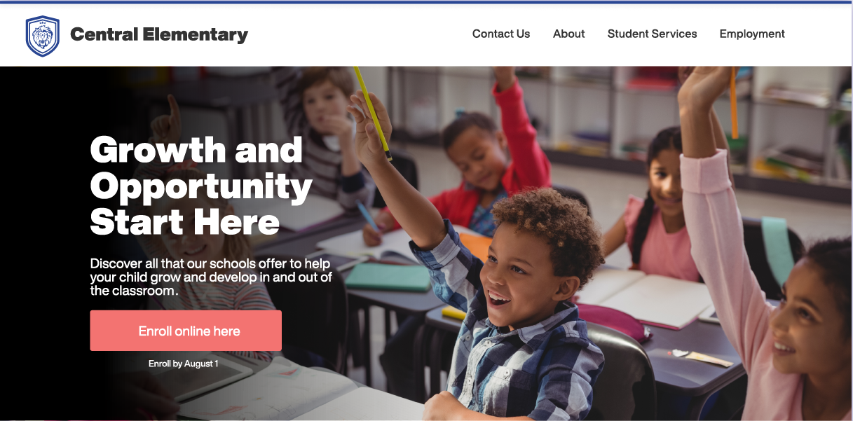
Unique selling proposition- A unique selling proposition is a statement summarizing the singular goal or purpose of your landing page. Usually, it’s in big, bold letters, followed by a sentence or two of supporting text. It’s a best practice to place the unique selling proposition above the fold, or in the top portion of the page visitors see before scrolling down. This way, it captures users’ attention as soon as they land on the page.
Banner image or video- A video or image can be used to visually reinforce your proposition. The unique selling proposition and image are like two peas in a pod; they should be placed together at the top of the page. As you choose your image, keep in mind how it will look on all device types. You want your image to look great on smaller screens, like tablets or mobile phones, as well as on a computer.
Call-to-action button- You’ll also want to include a call-to-action button at the top of the page, near the proposition and banner image. This button calls the user to take an action, like “Sign Up Today,” “Start the Enrollment Process,” or “Apply Online.” This button should always link to an online form where the user can complete the desired action.
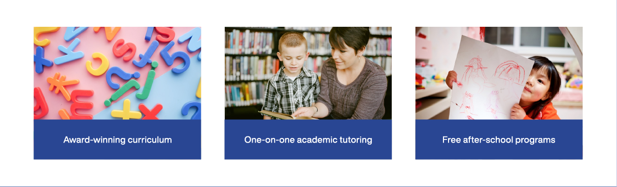
Benefits of your offer- Below these elements, highlight the benefits of your offer or proposition. Your benefits make the case for why your offer is the right choice or best option for your target audience. If your goal is enrollment, you might provide a list of reasons your district stands out from others. On an employment landing page, this section could include your employee benefits and more information about your community.
Social proof- Your landing page should include some form of social proof—examples of people who have accepted your offer and would recommend that others do the same. These can take the form of direct quotes, testimonials, or interviews from your school community.
Social proof is a critical trust indicator for people visiting your landing pages. It directly influences the way consumers make decisions these days—whether we’re purchasing something online or deciding where to have dinner. According to a survey from BrightLocal, a search engine optimization platform, social proof is just as powerful as a recommendation from a friend. They found that 88% of consumers trust online reviews as much as personal recommendations.

Form- Forms collect user information so the district can reach out later. In other words, they move your leads further into the decision-making process. In some cases, the form itself may appear on another page, but as long as a call-to-action button on your landing page leads to the form, you’re still following standard best practices.
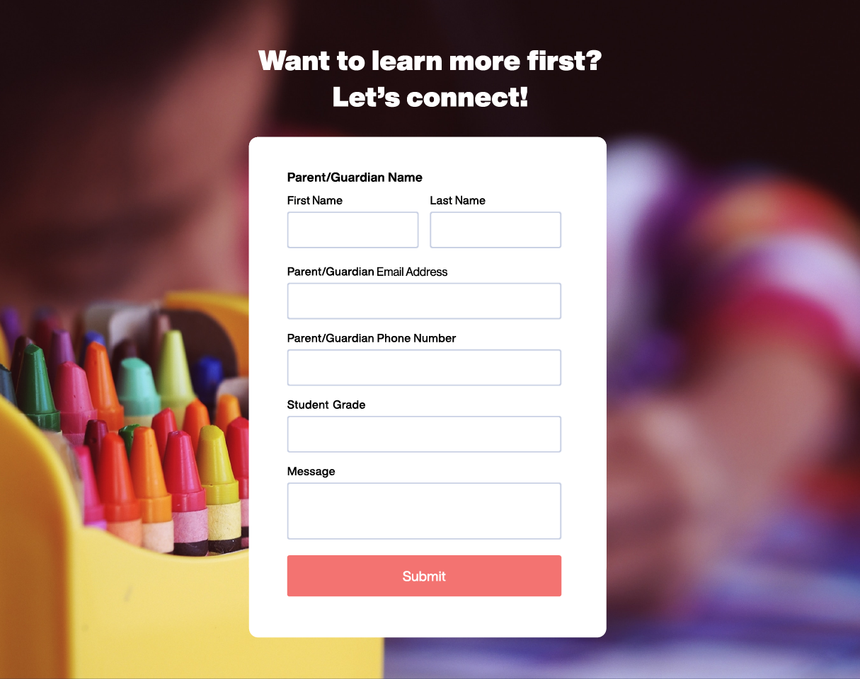
There’s a lot of debate in the private sector marketing world over how long a form should be. Some studies show that shorter forms increase conversion rates—the percentage of users that fill out the form. But other studies seem to prove the opposite. While most marketers agree that short forms lead to higher conversion rates, long forms are a great way to weed out people who aren’t truly interested in your offer. Why? Because someone who is seriously interested in taking the next step generally won’t be phased by long forms.
Landing Page Tips and Tricks
These six elements should serve as the foundational pillars of your landing page, but marketers are constantly testing new ideas and approaches. Here are three ideas worth trying.
Simplify your design.
When it comes to landing pages, a general rule of thumb is less equals more. As we said earlier, eliminating distractions makes it easier for people to focus on your central offer. The best way to do this is to simplify your design. While you should have at least a few photos or a video on your page, you don’t want to overwhelm the viewer with an excessive amount of information. Take away unnecessary graphics, photos, design elements, and harsh colors. Instead, stick to a template that’s clean, easy to read, and looks great on all devices. This makes the user experience more enjoyable and can help keep your site as accessible as possible.
Add video.
It should come as no surprise that video dominates other forms of online content. But video is more than just a means of entertainment. Google reports that more than 50% of people have used videos to help them make purchasing decisions. What’s more, videos on landing pages have been proven to increase conversions by up to 86%.
There are plenty of creative ways to incorporate video into your landing pages. Try including testimonial videos in your social proof section or creating a highlight reel of your showing how it feels to attend or work in your district.
There is no “one-size-fits-all.”
It’s been commonly understood by private sector marketers that short landing pages out-perform long ones. Short pages, after all, eliminate distractions and provide a simplicity that keeps people’s attention. But marketers have recently begun to debunk the “one-size-fits-all” theory in favor of a more nuanced approach. One study reports that longer landing pages increase leads by 220% compared to short pages with calls-to-action above the fold. As a result, more and more marketers are experimenting with longer pages— especially when the unique selling proposition is difficult to explain.
Think about an expensive online purchase you’ve made. Chances are, you did a lot of research and reading on the front end before making that purchase. When people in your community are making big decisions, like enrolling their kids in school or applying for an open position, they’ll want as much information about your district as possible. In other words, those who are serious about taking the next step will not be deterred by a landing page containing a lot of information.
That being said, if you opt for a longer landing page, keep our first tip in mind: Simple design is key. Make sure your text is laid out in a way that’s easy to read and not visually overwhelming. And, of course, tailor your approach to the task at hand. You may find that longer landing pages work for an enrollment campaign, but shorter pages perform better when getting teachers to sign up for a back-to-school event.
Whether you’re looking to do something simple, like getting families to sign up for a summer meal program, or something more complex, like launching a full-scale employment campaign, landing pages are one of the best tools for collecting information and supporting initiatives in your schools. But just as Rome wasn’t built in a day, sometimes it takes time to get the results you want. Keep experimenting and trying new approaches. Soon enough, your landing pages will be among your website’s most powerful assets.
Subscribe below to stay connected with SchoolCEO!