Owning Your Digital Spaces
How your district’s user experience determines the strength of your brand

When you think about your district’s brand, a few distinct factors likely come to mind. You may think of your district logo, your mascot, your hashtag, your school colors. You may even reflect on your social media presence and the impression you’re making online. But while all these factors contribute to your brand, they’re not actually the brand itself. Your brand is your district’s reputation: the way people think and feel about your schools.
Think, for a moment, about your own reputation as a school leader. You may be known for your boldness, your transparency, your innovative spirit, your compassion toward students, or any number of other characteristics. How did your community come to think of you in this way? It’s pretty simple: people interacted with you, or with the idea of you. They spoke with you at a football game, followed you on Twitter, or read an article about you in the local paper. Based on those interactions, people formed opinions of you. The community’s overall opinion? That’s your reputation.
It’s the same for your schools. Each time members of your community come into contact with your district, the experience they have contributes to their feelings about your schools. At the end of the day, your district brand is an amalgamation of all the experiences people have had with your schools and how those experiences made them feel. This means that your brand is a living, changing thing, constantly in flux.
Many school leaders are most concerned with the primary experiences their district provides: the relationships between teachers and families. But in the digital age—and especially in the COVID era—most of your audience’s experiences with your schools take place outside the classroom. We’re not just talking about social media here. We mean messaging platforms, virtual learning spaces, school apps, and learning management systems. Those digital experiences also contribute to your community’s feelings about your schools, and therefore your brand—for better or worse.
Right now, you may be leaving decisions about your school’s website, apps, and other digital platforms to someone else. But those choices are actually crucial to building and safeguarding your brand. If the tools you use are unintuitive or difficult to use, they’re reflecting poorly on your district—even if they’re not branded with your logo.
If you want to take control of your brand, you need to control as many of your audience’s experiences with your schools as possible. That means giving your parents, students, and community members a great experience every single time they interact with your schools, no matter where that experience is taking place.
The Apple Experience
If you want an example of a brand that goes far beyond a logo, look no further than Apple. When you think about iPads and MacBooks, you might picture the distinctive Apple logo, or even recall their slogan: “Think Different.” But those simple assets aren’t what make Apple such a strong, recognizable, popular brand. People love Apple because the company has perfectly calibrated every experience.
Just as your primary experiences take place in the classroom, Apple’s happen when users swipe through their iPhones or open up their Macbooks. After all, that’s the product they’re selling. But their technology alone isn’t enough to make Apple a powerhouse brand. In the end, the computers and phones themselves aren’t that different than those of competitors—but the experience surrounding those products is unmatched.
The Apple Store—a pristine glass storefront outshining other retailers in your local shopping mall—is just as much a part of the brand as the iPhone. So is the easy self-checkout that allows you to scan a product with your phone, pay with Apple Pay, and leave without speaking to a single soul. Need to fix a problem with your product? Just set up an appointment at the Genius Bar—no waiting in line required.
It’s not iPhones and iPads that have made Apple the brand it is today. It’s that they’ve carefully engineered every experience to make things as easy and attractive as possible for their customers.
Good user experience strengthens your brand.
As a school leader, you’re already somewhat of an expert at what we call “user experience,” often abbreviated “UX.” When it comes to the classroom, you’re constantly focused on the “end-user”—in this case, the kids you’re educating. As you make decisions, you put yourself in students’ shoes, asking yourself what will work best for them. But while you’re worried about what happens on campus, you might be ignoring your community’s digital experiences with your district.
So how do you ensure that those digital experiences are positive? In a recent Google study, the top three positive words used to describe digital brand experiences were “easy,” “helpful,” and “convenient.” Your parents, students, faculty, and community members want to minimize the amount of effort it takes to complete their tasks. Instead of thinking about where to go to find information, they want design to guide them there. In short, they want a good user experience.
When parents open your school app to look up a lunch menu, how easily can they find that info? If a student has a question, can they message their teacher without too much trouble? Those are both questions of user experience, and their answers are significant reflections on your district’s brand.
In the sections that follow, we’ll train you to look at your district’s digital experiences through your community’s eyes. By optimizing your user experiences across the board, you can impact how your community thinks and feels about your schools—and take control of your brand.
What makes a good user experience?
Even for experts, the concept of user experience can be difficult to understand. That’s why Peter Morville, one of today’s leading minds in information architecture and UX, created the user experience honeycomb, now a central tenet in the field of UX design.
According to Morville, a good user experience is composed of seven interlocking factors: useful, usable, findable, accessible, credible, desirable, and valuable. The idea of value lies at the very center of the honeycomb, and for good reason: the other six factors work together to create value.
You can evaluate your district’s apps, websites, programs, and platforms using a rubric based on Morville’s honeycomb:
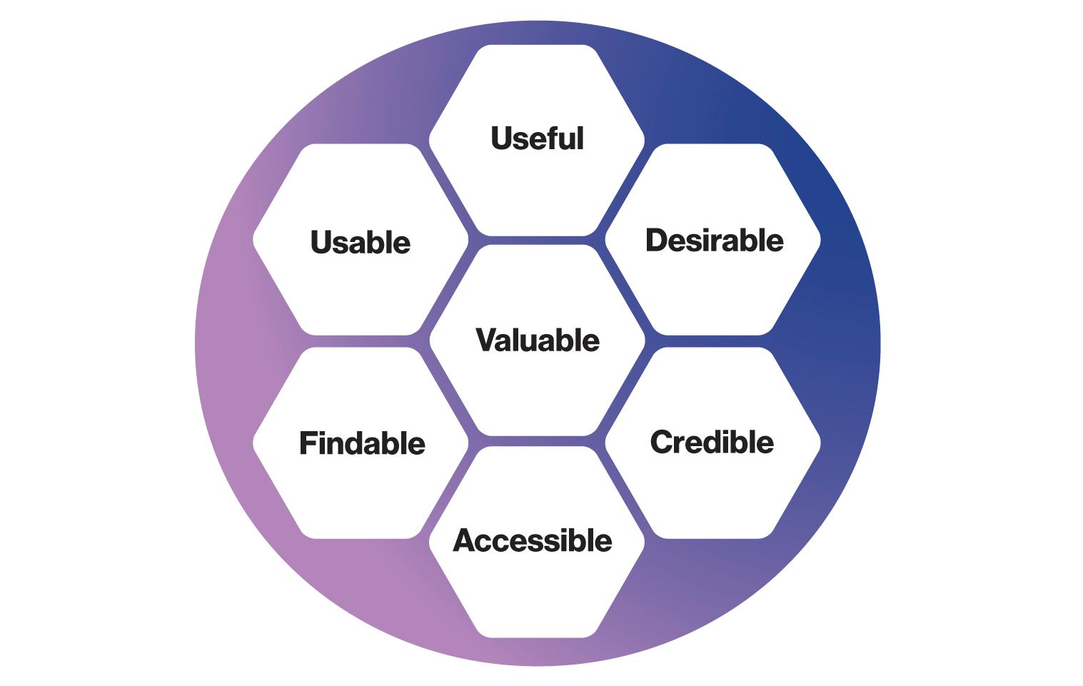
- Useful: Does it have a reason to exist? Does it fill a need?
- Usable: Does it work well? Can students and parents use it easily and intuitively?
- Findable: Can students and parents find it easily? Once there, can they quickly find what they’re looking for?
- Accessible: Is it ADA compliant? Can people with disabilities use it just as easily as anyone else?
- Credible: Is the content here up-to-date? Is it free of misspellings and grammatical errors?
- Desirable: Does it look good?
If even one of these factors is missing in your app, website, program, or experience, it’s not going to provide value to your audience. You may as well not waste your time—or theirs.
Let’s look at a simple example: your district’s digital newsletter. Maybe it’s beautifully designed, full of useful information, and completely credible and compliant. The sign-up is easy to find, and the subject lines indicate exactly what your audience should expect. There’s just one hitch: it’s extremely long, and most of your readers never make it to the end. Your audience wants digestible updates they can consume quickly—so the length of your newsletter is negatively impacting its usability.
Without that usability piece in place, your newsletter has lost all its value. It doesn’t matter how good it looks or how many worthwhile updates it contains. If your parents and community members aren’t actually reading the crucial information you’re sending out, why send it at all? In fact, this negative user experience could be hurting your brand. Annoyed by what they perceive as useless emails, your parents will still miss the important updates you included in that newsletter—and they’ll still have questions.
In short, a good user experience is one that provides value, and every other cell in the honeycomb is just another step toward that goal.
Usefulness
In 2016, entrepreneur Doug Evans introduced the world to Juicero. The high-tech juicer, which cost a staggering $700, required that users buy packets of diced fruits and vegetables from its parent company, which the machine would then scan via QR code. If the packets weren’t fresh, the juicer wouldn’t work. If they were deemed worthy of juicing, the packets would be squeezed by internal machinery with 8,000 pounds of force.
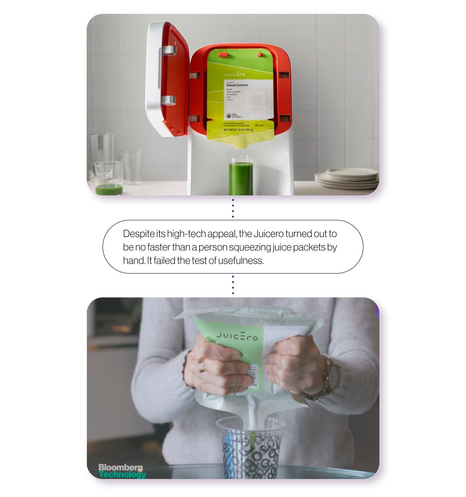
There was just one problem: Juicero wasn’t any more efficient than good old-fashioned elbow grease. A Bloomberg video published in 2017 showed a side-by-side comparison: the Juicero versus a person using both hands to squeeze one of the juice packets. As it turned out, the machine wasn’t any faster than the person. Juicero shut down completely just a few months after the Bloomberg video, brought down by their product’s total lack of usefulness.
When it comes to rolling out apps, platforms, or software for your district, you don’t want to end up like Juicero. Much like a Wifi-enabled juicer, a high-tech school app sounds very cool, but coolness alone isn’t enough. To be worth implementing, your app—or anything else—also needs to make life easier for your stakeholders.
Your technology should center around your end-users: your students and families. Instead of finding a reason to implement a certain platform or tool, work backwards from your audience’s needs and wants. What problems or inconveniences are your stakeholders facing? (If you’re not sure, ask!) Once you know, work to find the best solutions.
There’s nothing wrong with a high-tech school app—in fact, we think you should have one—but it shouldn’t exist just to check a box on some school technology checklist. It should serve a defined purpose and serve it well.
Usability
To foster a good user experience, your platforms must be easy and convenient to use. As you might imagine, usability goes hand in hand with usefulness; a platform that’s too difficult to use can’t accomplish its intended purpose. Usability comes down to two factors: speed and simplicity.
Speed
How quickly does your app, website, or platform load? While it might seem like a small detail, speed has a large impact on your audience’s user experience. After all, people are impatient. According to research from Google, when a mobile page takes just five seconds to load, the bounce rate (or rate at which your users leave your page) is 90%. Around 32% of users bounce if it takes just three seconds.
If users do stick around to wait, they’ll start to feel stressed. According to a study from Ericsson, a leading Information and Communication Technology provider, when mobile users are pressed for time waiting for a website to load, their heart rates increase by 38%. Their stress levels are comparable to those of someone watching a horror movie alone in a dark room.
According to District Brand Breakdown, a 2019 SchoolCEO analysis of over 1,250 districts’ digital brands, around 30% had load speeds over two seconds, and 15% over three seconds. That might not seem like a lot, but it means those districts could be losing almost a third of the users trying to access their sites. This doesn’t just mean parents. A third of job applicants, prospective students, and even engaged community members are giving up before the page loads. To increase usability—and improve your audience’s user experience—make sure your pages load as quickly as possible.
Simplicity
In 2000, a study at Columbia University sought to answer a deceptively complex question: Do consumers really want more choices? Researchers set up two tables at a high-end grocery store, each displaying gourmet jam. While one boasted a selection of 24 different jams, the other offered only six choices.
The results were astonishing. Only 3% of customers at the more extensive display actually made a purchase, but 30% bought from the smaller one. As it turns out, people facing a multitude of options get what psychologist Barry Schwartz calls “choice paralysis”—they’re so overwhelmed that they avoid decisions altogether. With a simplified set of options, people are better able to make a decision and move forward. In fact, in his book The Paradox of Choice, Schwartz argues that while options aren’t fundamentally bad, an abundance of choices actually makes us stressed and unsatisfied.
What does all this have to do with UX? Well, think about your website, your district app, your LMS, or any other digital space your audience has to navigate. As they try to find information, how many links, pages, or buttons are they presented with? How many apps and platforms do they have to search through to find their child’s math assignments? If they’re faced with too many choices, they’re likely to get overwhelmed and abandon their task in frustration. Needless to say, that’s a bad user experience.
One step toward a good experience is simplifying your audience’s decision-making as much as possible, removing choice altogether if you can. This means reducing buttons and links on your websites and apps—and cutting down the number of platforms you use.
According to research conducted by SchoolCEO in the summer of 2020, over a third of parents used three or more apps to keep track of their children’s education. In the words of one respondent, “Going to 7-10 different websites, programs, and platforms was overwhelming and time-consuming.” Want to make your parents’ lives easier? Reduce the number of tools they need to use. The more essential tasks they can accomplish on a single platform, the better.
As the reality of the COVID-19 pandemic set in at Fallbrook Union Elementary School District, Superintendent Dr. Candace Singh became attuned to this very problem. “We were using multiple programs for the kids,” she tells SchoolCEO—one platform for reading, another for math, yet another for science. “That was very challenging because we did not have the ease of use that we really needed, particularly for young children and their parents. We needed to simplify and streamline that process.”
Teams of Fallbrook teachers came together to review new, simpler platforms with more capabilities. “The new platforms provided them with all the tools they felt were important, but they didn’t have to go to six places to use them,” says Singh. “Now, it’s so much more efficient for our teachers, for our parents, and for our kids.”
Findability
For your audience to have a positive experience with your websites, apps, and platforms, they must be able to easily find what they’re looking for. When your parents and community members open your district app, visit your website, or log onto your LMS, how is the content organized? Is it immediately clear where users can find answers to their questions?
Much of findability goes back to the idea of simplicity: reducing the number of decisions your audience needs to make to find information. Having fewer links, tabs, and buttons increases the speed and ease with which your parents and students can get where they’re going.
As you think about findability, keep in mind a crucial segment of your audience: families and teachers who aren’t yet involved with your schools. They’re searching the internet, trying to find information about your district. Creating a good user experience includes making that process easy as well.
That’s where Search Engine Optimization, or SEO, steps in. While SEO helps draw people to your site, it also contributes to a positive user experience; it helps your audience find what they’re looking for. But SEO is a complicated topic, one that deserves an entire article all for itself. You can learn more about it in Winning the SEO Race.
Accessibility
To build a great user experience for everyone, you have to ensure that those with hearing, visual, or mobility impairments can access your content just as easily as anyone else. It’s not just good UX; it’s required by the Americans with Disabilities Act, or ADA.
We know you’re more than familiar with the issue of accessibility, and you may believe you have the issue covered. But of the district sites we analyzed, a startling majority—91%—had critical errors that made their websites inaccessible. What’s more, a whopping 67% lacked accessibility forms where users could report issues.
According to the CDC, one in four Americans live with disabilities. If your websites, apps, software, and other digital tools aren’t accessible, you’re alienating more than a quarter of your potential audience.
For more information about the ADA, accessibility, and providing a great user experience for everyone, find our 10 Tips for ADA Compliance.
Credibility
Imagine a prospective parent is viewing your district website for the first time, trying to make a decision about where to send their child. This is a crucial moment in the enrollment pipeline—and the outcome depends, at least in part, on whether or not their user experience on your site engenders trust. If you want to strengthen your brand, you need to build credibility with your audience.
According to the Chicago Tribune, user experience expert Jakob Nielsen “knows more about what makes websites work than anyone else on the planet.” Way back in 1999, Nielsen determined a few factors that contribute to a website’s credibility—and more than 20 years later, they still ring true. Here, we’ll go over just a couple: transparency and current content.
Transparency
Consider your own digital experiences with brands. Have you ever abandoned a site when you couldn’t find information about payment or return policies? Your audience, especially those yet to be involved with your schools, are evaluating your digital presence the same way. If parents can’t easily find, for example, your accommodations for special needs students, they may assume you don’t have any—and continue their search elsewhere.
As you work toward greater transparency, start by asking what information is most useful to your audience’s interests. After all, transparency isn’t about overloading your audience with information—that will actually overwhelm them, making the information they need harder to find and producing a negative user experience. Focus on the questions you typically get, the info you know people actually want. Parents will likely be interested in your school ratings, your unique programs, or your accommodations for special needs students. Prospective teachers will want to know more details about your area or what benefits your faculty enjoy.
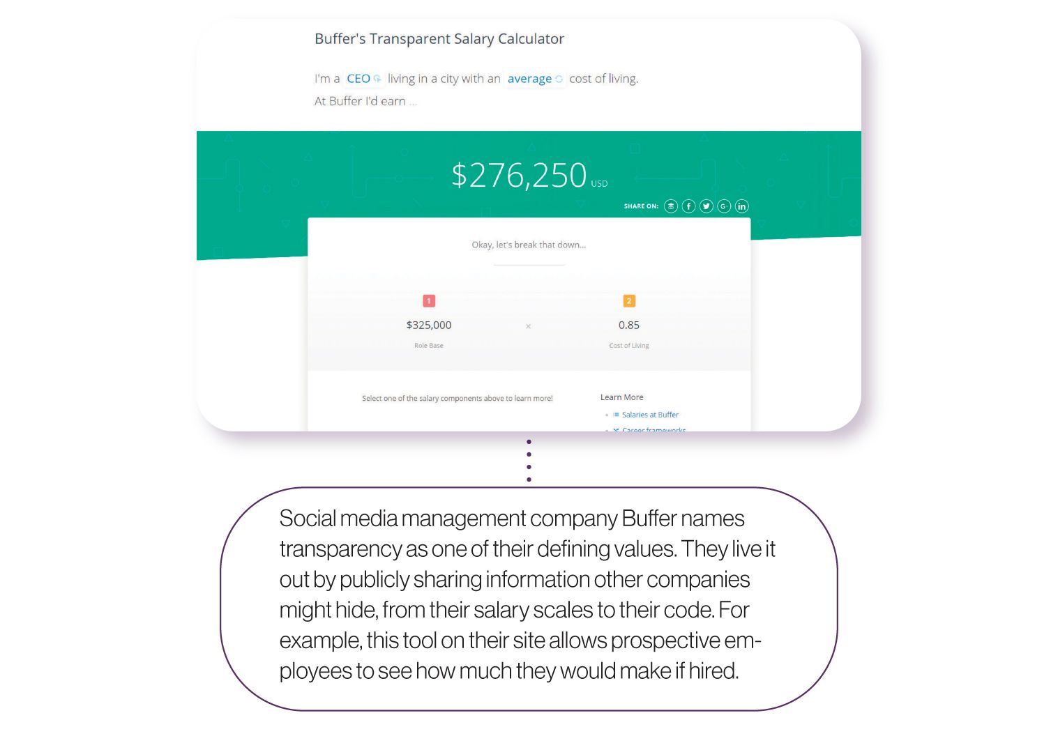
Once you’ve considered all the information prospective families and teachers might need, build out enrollment and careers pages detailing that information. Link to those pages prominently from your homepage. The more relevant info your audience has at their fingertips, the easier their user experience will be—and, most importantly, the more they’ll trust your brand.
Current content
There’s a reason popular social media apps like Twitter and Instagram heavily favor recent posts in their timeline algorithms. We don’t want to know what happened two weeks ago; we want to know what’s happening right now.
The same is true for your parents and students. When they open your mobile app, log onto your LMS, or check your website—whether for the first time or the 500th—they want to see up-to-date, relevant information. Imagine a parent searching your app for a lunch menu, only to find one that’s two months old. Odds are, they won’t bother to come back next time.
Refreshing your content frequently doesn’t have to be a heavy lift. It can be as simple as announcing an upcoming parent-teacher conference or posting pictures from a recent fundraiser. Just remember that you can’t keep new people coming in unless you’re keeping your content up-to-date.
Desirability
One of the factors Nielsen cites in his list of credibility factors is design quality—in other words, how a site or platform looks and feels. Morville refers to this same concept in his user experience honeycomb, deeming it “desirability.” Believe it or not, the aesthetics of your district’s digital spaces contribute to the way your audience engages with—and even trusts—your brand.
While we may think we make judgments based on logic and reason, we form first impressions incredibly fast. According to a study published in Behavior & Information Technology, it takes about 50 milliseconds—one-twentieth of a second—for us to form an opinion about a website. To build your brand and provide a good user experience, you need your digital spaces to look great, right from the get-go.
So what’s the relationship between the aesthetics of a digital space and how much people trust it? A study from the Stanford Web Credibility Project determined that 46.1% of consumers judge credibility, at least in part, on “the overall visual design of a site, including layout, typography, font size, and color schemes.”
In another study, researchers from Northumbria University and the University of Sussex followed 15 women while they browsed various medical sites, looking for advice and answers as they faced stressful medical decisions. Researchers found that when the women rejected a site, they usually did so because of weak design elements such as boring web design, small print, too much text, and a corporate look and feel.
However, when the women described the sites they trusted, they didn’t actually say much about looks. Instead, they pointed to informative content, relevant illustrations, and unbiased information.
A well-designed website isn’t always the flashiest or the prettiest; in fact, flashiness can sometimes distract or even put off your audience. Here’s the thing about design: when something looks bad, we notice. But when something looks aesthetically appealing, we don’t think about the design much at all. Good design frees up space in your audience’s minds to focus on the info they’re looking for—and that provides a good user experience.
In the aftermath of COVID-19, the role of technology in education is only going to grow. That means the role of user experience in your brand’s strength is more crucial than ever. Consistently bad user experiences aren’t just a miserable slog for your parents and students; these days, they may be deal breakers. Rather than suffer through the hassle of your technology, they might choose to move to a school with a savvier digital presence.
Good user experience, on the other hand, drives your parents and students back to your digital spaces again and again. When they need something, they’ll know where to find it; when they use a piece of software, they’ll know it will work. And on a deeper level, they’ll trust that whatever technological advances come to bear in education—whether it’s online learning or a new challenge altogether—your district will be ready to create a smooth experience again.
Subscribe below to stay connected with SchoolCEO!