Tie It All Together
The importance and power of creating a seamless, unified online identity

This article is even better when paired with the companion discussion guide.
During the COVID-19 pandemic, learning takes place at home, at the YMCA, in district classrooms—anywhere with a WiFi connection. Your district’s reach is as widespread as ever, giving you a variety of platforms to share your story. A key tenet of sharing that story, and in turn building a strong brand, is consistency.
In District Brand Breakdown, a 2019 SchoolCEO analysis of over 1,250 districts’ digital brands, we found that consistency is a weak point in district branding. While most districts have bits and pieces of the branding process down pat, a unified brand—consistent across the district’s website, social media pages, and mobile app—was difficult to find.
In the private sector, companies spend millions on branding toolkits that build consistency. Starbucks created a website that shares not only their brand guidelines, but the theory behind them. Twitter provides downloadable files, icons, and even snippets of code for embedding their logo. And if you share any business’s logo in the wrong context, you could face legal trouble.
There’s a reason why companies invest so much in branding: consistency builds trust. Every time a parent or teacher “sets foot” in your digital spaces, they get an impression of your schools. If your social media header cuts out half of your logo, it’s probably not a deal breaker, but it also isn’t a great brand impression.
Unifying your brand feels a bit like sitting down to a 1,000 piece puzzle. As you start to work, you might feel a little overwhelmed by the amount of pieces, by the many small problems you need to solve. But as you group together like colors and shapes, building systems for your work, your pile of pieces will dwindle smaller and smaller. Eventually, you’ll match your last piece, making a complete and unified image.
We’ll go through each piece of the puzzle, focusing on three common areas for building consistency: story, look, and presence. Many of these fixes are simple, and they don’t take much time. If you tackle these projects little by little, one day you’ll sit down to a unified brand image, a welcoming digital infrastructure for your schools.
Consistency in Story
When you think of branding, you might think of the visual: logos, fonts, and templates. After all, visual cues help us recognize a brand in milliseconds, and it’s important to have those tools at the ready. However, the most powerful tool in your branding toolbox actually goes beyond looks. To build an emotional connection to your brand, you need a story.
There’s a reason why big brands like Apple and Nike use story in their marketing campaigns: the simplicity and repetition help you remember them. Every time Nike shares an athlete winning a gold metal in Nike gear, #JustDoIt ties that post back to the brand’s larger narrative: Nike equips athletes to win big.
But story shouldn’t be an afterthought. Instead, think of your district’s story as a blueprint for your branding. If innovation is at the core of your district’s identity, that message should fill your website banners and social media headers. Your story should be written into the core of your digital brand.
#1: District Narrative
Your district narrative encapsulates your schools: your values, your mission, your vision. Think of it like an elevator pitch. Your district narrative is the story of how your schools uniquely serve your community.
Every story has a hero. You might assume that your district—fearlessly serving students—is that protagonist. But to move your marketing from good to great, position your stakeholders as the heroes in your story. In Nike’s branding, for example, Nike isn’t the protagonist. Their athletes, winning championships and gold medals, are the heroes in every story. Nike merely gives them the tools they need to succeed.
In your district narrative, position your district instead as a wise and helpful guide: Dumbledore to Harry Potter, Yoda to Luke Skywalker, an athletic wear company for champions. To build out your story, work through these two questions.
What do your stakeholders need? As a school leader, you know your community’s most pressing needs. Teachers are clamoring for emotional support, parents are pushing for a strong community environment, and business leaders are requesting a highly trained workforce. Every community needs all of these things—but you’re probably already thinking of a few areas where your district excels.
What do you provide them? Every district offers students a high-quality education, but each district does so in a unique way. What factors make your community different from neighboring schools? These are the things you love to brag about in board meetings and might share with prospective families.
The intersection of these two questions is your district narrative: the story of how your district is actively helping your community blossom.
#2: District Tagline
Your tagline is a short, catchy version of your district narrative that helps unify your story. Keep it to as few words as possible—the shorter the better. Then, make sure everyone who works for your district is using that language: in their handouts, in their emails, in their everyday conversations.
If your district community isn’t inclined to use your language, you’ve probably chosen the wrong tagline—one that doesn’t resonate with your community’s perception of your schools. A great tagline is a blend of visioning and reality. You want your audience to recognize your schools while envisioning a bright future.
Once you’ve distilled your district’s purpose into a tagline, add that tagline to your header images, website banners, and social media bios. Only 7% of the districts we analyzed had consistent social media bios that gave some indication of the district’s identity. This is a very simple place to boost your district’s professionalism.
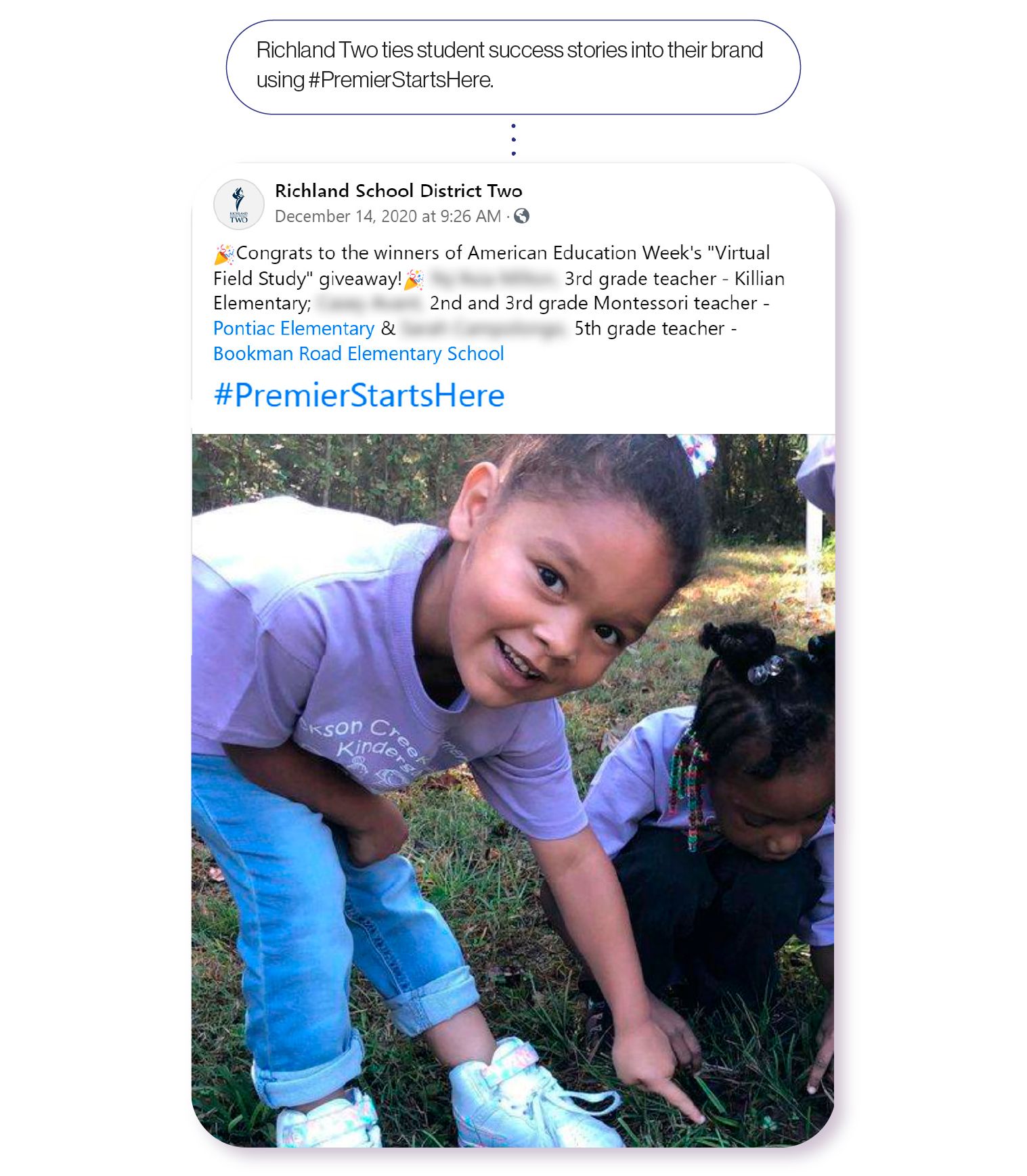
Take Richland School District Two, for example. This large, high-performing district in South Carolina has branded itself with the tagline Premier Starts Here. But they didn’t just create the tagline and leave it. Premier Starts Here is a unifying force, tying the district’s content together to tell a larger story.
On the district’s homepage, Premier Starts Here fills the header. A photo collage of Richland Two students cements that narrative: they show students in the classroom, at graduation, grinning after a win at a science fair.
Right under that header, Richland Two shares individual stories that support this messaging. Sometimes they share updates, oftentimes celebrations. But each story connects to form a larger picture: Richland Two offers an experience that cultivates premier students.
On social media, they extend the narrative. To build consistency, the district infuses their tagline into each social media post with a hashtag. Every time students exhibit growth, Richland Two ties the story into their brand with #PremierStartsHere.
Consistency in Look
Creating consistency in look is less like cooking—throwing in whatever you have on hand—and more like baking. You need to follow the recipe. Each time you use your district’s logo, you should use the right file type with the exact color scheme, not skipping even one step.
While there’s a time for artistry, creating a consistent look is all about repetition. If your branding starts to feel redundant, that means you’re doing it right. Luckily, most of the mistakes common in district branding are simple fixes that make a big impact on your look.
#3: District Logo
Your district logo is your bread and butter, the core of your visual identity. As such, it’s an important piece of your puzzle—one worth spending time and money on.
Historically, logos were created to differentiate products. In the mid ‘40s, Tide came out with their signature, heavy-duty laundry detergent. But looking at a wall full of products, consumers couldn’t easily tell the detergents apart. So Proctor & Gamble hired architect and famous industrial designer Donald Deskey to design what would become the Tide bullseye. Compared to the muted colors of other detergents, Tide’s bright orange and blue make the classic logo pop—establishing brand recognition.
Your district logo shouldn’t just be a check-the-box solution. It is an opportunity to both define and differentiate your schools, just like the Tide bullseye. However, you’re probably not the only district in the country, or even state, with your mascot. That’s not a problem, but if your logo is an exact copy of someone else’s—whether it’s another district or a professional sports team—you’ve got an issue. Your logo should be a tool that separates your brand from the competition, and you don’t want families to muddle your schools with other organizations.
Districts also have an opportunity to link individual school brands with the district brand, making a powerful, unified brand family. Think of it this way: If a parent’s car displays bumper stickers for your district’s elementary, middle, and high schools, all three stickers should look like they go together. Sure, the logos may be different, but using consistent colors, fonts, and styles helps unify your brand, packing a powerful punch.

There are also a few small, technical errors that, once solved, have big payoffs. For example, most districts aren’t sharing a consistent logo across communication platforms. The district’s official Facebook page might have a logo of a gray bulldog baring its teeth, while the website logo is illustrated in a different style, with the dog’s jaw closed. This type of inconsistency is actually quite common. Of the districts we analyzed, only about 30% used a consistent logo across their website and social media channels.
Even if you’re using the same image, it’s important to use the right version of it. Using the wrong file type on your website or printed shirts will mean that your logo comes off as blurry or illegible. Plus, you’ll need versions available to fit both light and dark surfaces, big and small. Building consistency, after all, doesn’t mean that you can’t have any variation—but each version of your logo should intentionally tie together.
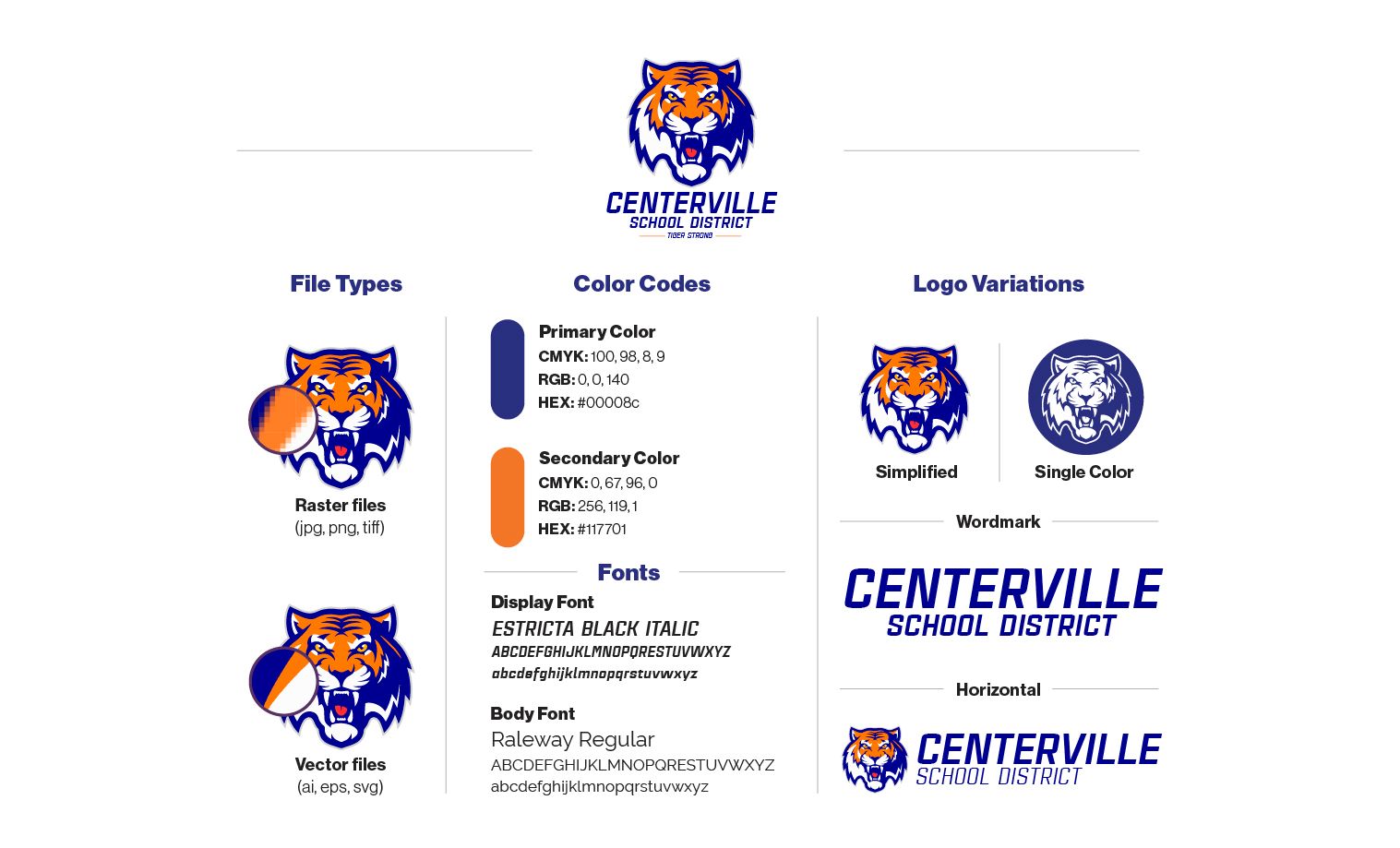
Core Logo Files
In order to tackle all of the branding projects coming your way, you’ll need several file types of your logo. There are two basic kinds of file types: vectors and rasters. You’ll need versions of both types as your core logo files.
Have you ever tried to enlarge an image, only to find that it gets pixelated as it expands? That problem occurs when you use a raster file instead of a vector file. Vectors—files whose extensions end in ai, eps, or svg—are built differently than rasters. Rather than tiny, colored boxes, vectors use mathematical formulas to display their images. This allows them to stretch to any size without losing image quality.
You need a vector version of your logo for printing larger items like banners or signs. Using a vector file will keep your logo looking clean and crisp from close up or far away.
You more than likely already have raster versions of your logo—ones with extensions like jpg, png, and tiff. Rasters have their own uses. JPEGs, for example, work great when you need to keep your file sizes small. Think footers for your emails or pictures for the web. PNGs and TIFFs have the added benefit of allowing a transparent background, but that can sometimes result in larger files if you’re using lots of colors. Of course, larger file sizes will affect your website and app’s load time.
If you’re not sure how to create these different versions of your logo, don’t worry. Hire a local graphic designer or even check in with a tech-savvy student in your district.
Logo Variations
You’ll also want to keep other versions of your logo on hand, depending on your project. If you’re printing your white logo on white paper, for example, you’ll need to have a version that contrasts with its background. Here are a few common variations you’ll want to have on hand.
- Simplified version: Many schools have complex logos that won’t work when scaled down in size. But on occasion, you might need an extra small version of your logo—for example, to use as an icon on your website or app. For this purpose, you’ll need a simplified logo, something that’s still identifiable without any extra details.
- Single color version: Several occasions call for a single color. You’ll need a black version of your logo for printing in black and white, and a white version for displaying over dark backgrounds, whether it’s the shaded corner of a photo or your school’s shade of navy blue.
- Wordmark version: A wordmark is a consistently designed logo that doesn’t include an image—just your district’s name. If your district chooses not to use a mascot or image, your wordmark can serve as your primary logo.
Logo Use Guidelines
Once you’ve made all your logo versions available, you’ll want to offer a few basic guidelines detailing how and when to use them. After all, your logo is the most important symbol of your brand, so you’ll want to make sure it stands out in all of its forms.
- Minimum sizes: To ensure legibility, establish a minimum size for each of your logos, especially those with words involved.
- Clear space: You don’t want to crowd your logo with other copy or design elements; it needs room to breathe. Set a specific amount of clear space to surround your logo on all sides. Usually, you determine the right amount of clear space by selecting a central element of your design to be your x indicator—basically, your measuring stick. For our example Centerville logo, we might choose the tiger icon as our x indicator. The height and width of that icon will serve as our benchmark for clear space.
A common misstep we see on social media is a poorly cropped image. Because of the way Facebook and other media sites automatically crop header and profile images, your gladiator logo might get decapitated.
We suggest researching Facebook, Twitter, and LinkedIn’s preferred image sizes for header and profile images about once every six months; they change frequently. Also, you’ll want to check how each of your profile images perform on mobile as well—sometimes social media platforms crop mobile images differently than those built for desktop. This is also where the x indicator comes into play; the extra space around your logo gives you a buffer for mistakes.
#4: Primary and Secondary Colors
You probably already have school colors—but you might not have prescribed shades of those colors. There’s a big difference between navy blue and baby blue. If you don’t have a plan, you could end up with wildly different color palettes across your district, damaging your brand’s consistency.
For each of your school colors, you’ll need to identify three different color codes: your CMYK number for print and your RGB and HEX numbers for digital media. Then, pick a few accent colors that work well with your major school colors—you might use them for borders, links, or other purposes. Determine specific color codes for those as well.
Several online tools, such as colorbook.io or htmlcolorcodes.com/color-picker, can help you determine the correct codes for the shade you want.
#5: Fonts
Apple primarily uses San Francisco, a font they designed themselves, across their advertisements and product line. If you close your eyes, we bet you can picture what it looks like: simple, clean, rounded lines. The style enhances their branding while keeping their content unified.
Choosing specific fonts is a simple way to tie your district’s content together, and you’ll actually only need a couple in your toolbox. First, you’ll want a display font to use for titles and headings—think the headline of a newspaper article. You’ll also need a font for body copy: the everyday text that makes up the content of your mobile app, website, or print materials. (For example, what you’re reading right now is body copy.)
We can’t tell you which fonts to use, but there are a multitude of options to choose from. You can even purchase your own fonts, and some districts do. If your budget is tight, we highly recommend using Google Fonts. They’re free, and they’re always available for download when you need them.
For body copy, a few of our favorites are Montserrat and Raleway, both of which are available for free through Google Fonts. These don’t just look good; they’re also versatile, offering several different weights (light, bold, italic, etc.). Your display font will naturally be larger and demand more of your viewers’ attention at first glance. This is a good opportunity to add a bit of flavor to your brand—while ensuring that it is still clear and easy-to-read. In our example, we’re using Estricta Black Italic. No matter what, avoid hard-to-read fonts like Papyrus or goofy-looking ones like Comic Sans. These don’t just look bad; they often cause accessibility issues.
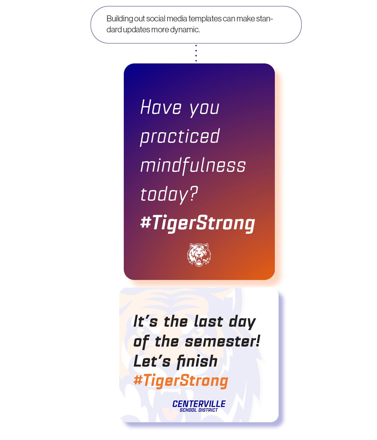
#6: Templates
An easy way to boost your consistency and save time in the long run is to create templates. By templates, we mean standard designs for posts and emails that help you put together consistent, branded messages in minutes. Then, when you scroll through your district’s website, newsletters, and Instagram profile, you’ll find consistency.
For example, you’ll want official district letterhead and newsletter templates (whether for print or email). When the time comes to send out a newsletter or board update, just pop in information and photos.
On social media, you’ll want a few templates that brand everyday updates. Nowadays, there are a variety of websites that make branding and design easy: Canva, Desygner, and PostCreator, just to name a few. As you’re looking at all of your templates laid out—using the exact same fonts, colors, and logo—they should tie together seamlessly. Your schools’ media will start to feel singular to your district, creating a stronger brand.
Consistency in Presence
Unfortunately, many districts don’t have a reliable presence online, making it difficult for them to build a relationship with their prospective audiences. According to The Disconnect, a 2017 SchoolCEO study, only 68% of districts had a Facebook presence, and only 53% were on Twitter. Almost a quarter—22%—had no social media presence whatsoever.
Of those districts who had a presence across all social media platforms, many weren’t sharing consistent stories. We found that only a small fraction of schools, about 8%, hit standard private sector marketing targets for posting online. Many districts might post multiple times a week for months, then have a dormant feed over summer break.
Posting consistently helps your audience engage. Think of it like building a friendship. Sure, we all have old friends we check in on every few years—but those are not the people we depend on in a bind. Schools, on the other hand, must be reliable. Creating that trusting relationship takes work, time, and regularity.
But while consistency on external channels, like Facebook and Instagram, is important, there are other channels schools are missing out on. Parents access district tools—your LMS, parent communication software, school app, even alerts system—on a daily or weekly basis. And it turns out, most districts don’t take the opportunity to brand these digital spaces.
Every time users have an experience with district software, they leave with an impression of your schools. It’s important to craft great digital experiences for your community. But you’ll also want to connect your brand to that great user experience. When you send parents into another app’s interface or to an external LMS, you’re missing a branding opportunity.
In our analysis of district brands in 2019, we found that around 68% didn’t have an app branded by the district. That means that when parents look for information from a district app, they’re booted to an external software that isn’t branded by the district. Unification not only helps your branding, it builds up your reputation as an innovative district.
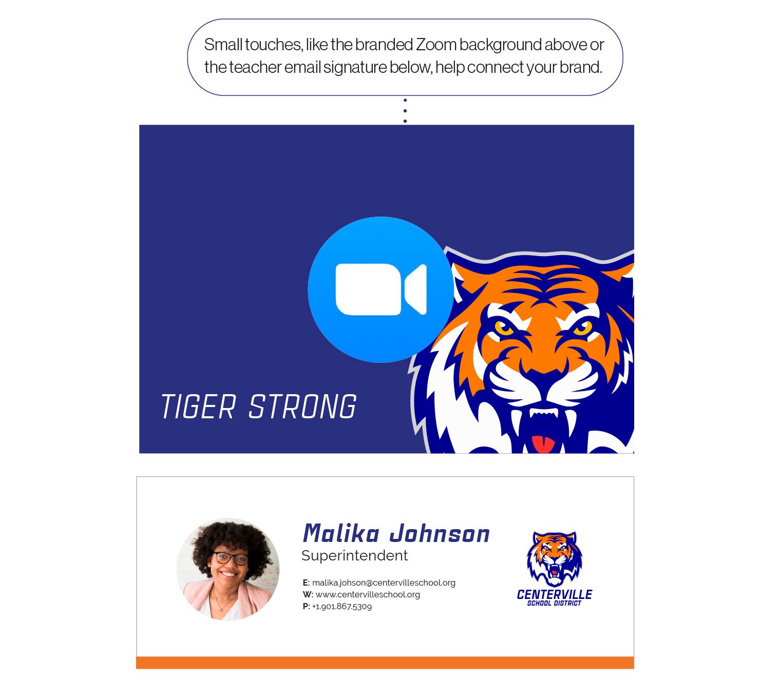
#7: Toolkits for the Classroom
Most families will connect with the district primarily through their students’ teachers. Parents will email back and forth, connect with a teacher in their classroom or over Zoom—maybe even walk past their student logged into a Zoom classroom. Each interaction families have with the district helps build your brand, so think of ways to tie those interactions back to the district.
Getting Started
Unifying your brand is a daunting task that requires a multitude of small, technical challenges—just like a puzzle. It can be tempting to push the process onto someone else’s plate or to ignore it altogether.
However, building a strong digital brand is part of creating a professional, unified identity for your district. While there are technical pieces, digital branding is ultimately leadership, establishing a strong vision for your district. You, as a district leader, are already perfectly equipped to lead the charge.